Let’s review a few data points before technical analysis of the S&P 500 and Dow charts.
If you are a financial markets bug, you remember Jim Cramer’s famous “they know nothing!” rant on Aug. 3, 2007. He completely lost composure live on CNBC while sounding off on the Federal Reserve chair at the time, Ben Bernanke, for ignoring impending signs of financial crisis stemming from mortgage market issues. Despite Cramer’s shortcomings, as we all have in common when predicting market moves in one direction or another, at least he stepped up to the mainstream media plate to call out one underlying problem a year in advance, before the crisis metastasized into a global collapse. There were numerous analysts calling out the inevitable crash scenario a year or two prior, but Cramer’s rant is one that sticks in my mind as a psychological turning point while sitting at my global risk management seat to the show at a TBTF Wall Street banking institution.
One of the least-discussed variables when assessing the big picture of financial conditions is the Velocity of Money, which is still falling, but may be flattening a bit. We will see, as there is a lag in the published data. I like to call it the Velocity of Paper.
Velocity of Money… “M1, M2, and MZM (M3 is no longer tracked by the Federal Reserve); Consider M1, the narrowest component. M1 is the money supply of currency in circulation (notes and coins, traveler’s checks [non-bank issuers], demand deposits, and checkable deposits). A decreasing velocity of M1 might indicate fewer short- term consumption transactions are taking place. We can think of shorter- term transactions as consumption we might make on an everyday basis. The broader M2 component includes M1 in addition to saving deposits, certificates of deposit (less than $100,000), and money market deposits for individuals. Comparing the velocities of M1 and M2 provides some insight into how quickly the economy is spending and how quickly it is saving. MZM (money with zero maturity) is the broadest component and consists of the supply of financial assets redeemable at par on demand: notes and coins in circulation, traveler’s checks (non-bank issuers), demand deposits, other checkable deposits, savings deposits, and all money market funds. The velocity of MZM helps determine how often financial assets are switching hands within the economy.” – Federal Reserve Bank of St. Louis
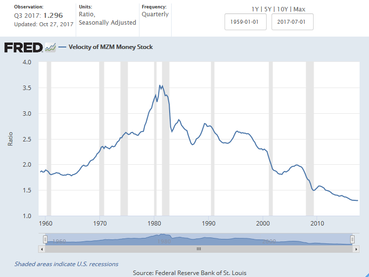

Back in Jan. 2017, Hoisington Investment Management EVP Lacy Hunt appeared on Bloomberg and discussed why the velocity of money still matters. A few months later, he appeared at the Strategic Investment Conference and explained why the Fed’s monetary policy is destabilizing, and tied that in to the velocity equation. It’s a short and easy connect-the-dots explanation that any non-professional can understand.
What else is going on behind the scenes? Insiders are sending messages, and the Fed has not begun reducing its balance sheet as promised. Lynette Zang, over at ITM Trading, put together a good presentation yesterday on the current state of the markets. Here is one slide on insider selling vs. buying, broken down by sector. Another is on the great TaperCaper. It looks like sellers have been unloading positions for about a year.


How are folks feeling about the markets? Nobel Prize-winning economist Robert Shiller was on CNBC this week, and he said he sees worrying signs about market sentiment. It is both the individual and institutional investors that are losing confidence. And it’s not just the one-year confidence, but also valuation confidence, with the lowest sentiment data readings in over 16 years. He thinks strength in the Trump boom is still a factor, but something psychological is going on. I’d say it’s greed.

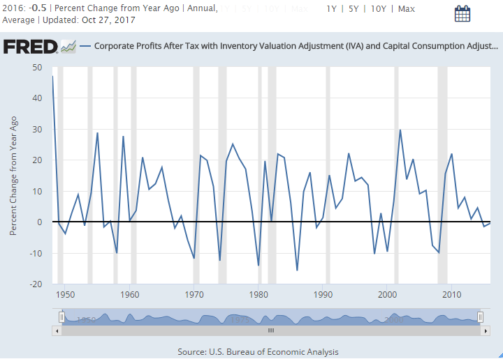
How are corporate profits looking? Not too hot, according to the Federal Reserve Bank of St. Louis…
A few good reads to chew on:
- Einhorn: “None Of The Problems From The Financial Crisis Have Been Solved”… “Ah yes, the Fed-funded ‘deflation trade’ which lowers prices for goods and services courtesy of ravenous investors who will throw money at any ‘growth’ idea, without considerations for return or profit, because – well – more such investors will emerge tomorrow. After all, in this day and age of ZIRP, what else will they do with their money.” – ZeroHedge, Nov. 2017
- Brief Observations: Leadership Reversal, Hindenburg Omens, and Titanics – Hussman Funds, Nov. 2017
- The Last Time These 3 Ominous Signals Appeared Simultaneously Was Just Before The Last Financial Crisis – Michael Snyder, Nov. 2017
- The Great Crash of 2018? Look to the bond markets to trigger Mayhem! – Bill Blain, Nov. 2017
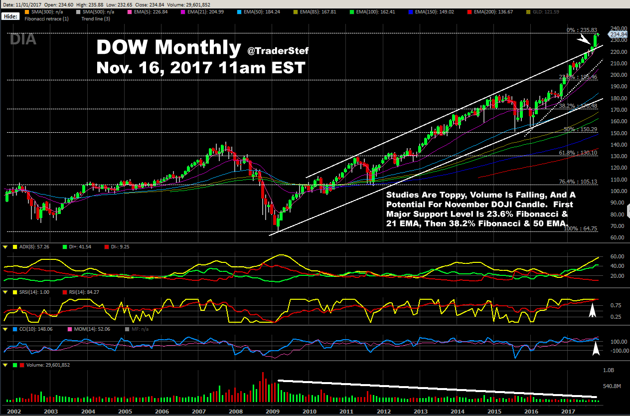
On to the charts. Remember these Inverse H&S calls?


Why focus on the S&P 500?
“The S&P 500 is widely regarded as the best single gauge of large-cap U.S. equities. There is over USD 7.8 trillion benchmarked to the index, with index assets comprising approximately USD 2.2 trillion of this total. The index includes 500 leading companies and captures approximately 80% coverage of available market capitalization.” – S&P Global

At first glance, without focusing on any single characteristic, it is obvious that SPY has reached an apex. Some type of correction is near. Profits will be taken willfully or forcefully. Willfully after a Momo extension due to successful tax reform or other news perceived as bullish. Forcefully due to Black Swan, negative financial or geopolitical news, combined with algorithm mayhem. How large? It depends, but Mr. Fibonacci will never let you down. If the correction appears not to be news-driven, but profit-taking after another leg up, going down to the dotted trendline or 21 Exponential Moving Average (EMA) is a given, with a pivot to retest the highs. If a correction comes with heavy volume and the 21 EMA is decisively breached, price is going to the 23.6% Fibonacci level and 50 EMA. Any level beyond that depends on the volume and reason for the correction.
Picking apart the chart, note that volumes are falling, like they were before the 2015 correction. The StochRSI is at an extreme and extended top. The DMI-ADX looks like it still has upside momentum, but it won’t last much longer because the other studies are weighting the odds to a rollover. This is a monthly chart, so I cannot confirm any candle type yet, but if the price were to close a little lower than today at the end of the month, there would be a Doji print. Given how extended the bull wave is, a Doji would likely indicate a bearish reversal.
Analysis of the Dow is nearly identical, with these exceptions: 1) Note the breach above the topside trendline last month. A huge candle, but no volume. 2) Volume has been falling ever since the bull began in 2009. Where is the liquidity? When it corrects, it will be fast and furious. 3) There’s not much support at the 23.6% Fibonacci, except for the 21 EMA and that dotted trendline, so a run down to the 38.2% area is more likely if a correction is on large volume and decisive.
Got gold and silver?
Plan Your Trade, Trade Your Plan
TraderStef on Twitter