In today’s post, we will focus on three pretty exciting charts, courtesy of www.InvestingHaven.com. The first chart shows the CRB index, a basket of key commodities including energy, softs, metals, etc. It is a secular chart, going back to the early 80ies, so it...
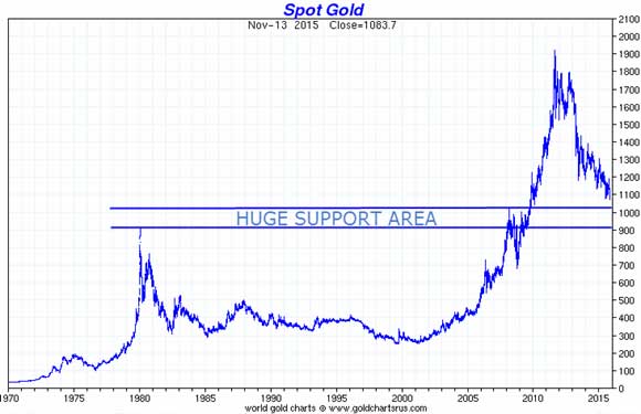
Gold’s long term chart shows how close we are to reaching secular support, going back several decades. As old resistance becomes support, we expect the peaks of 1980 (850 USD/oz) and 2008 (1030 USD/oz) will provide HUGE support. Moreover, the psychological level...
It is widely assumed that gold and debt have a strong positive correlation. The more debt is created, the lower the value of currencies, the higher the value of gold. That’s the rationale. In recent years, many (gold minded) investors have suggested that gold...
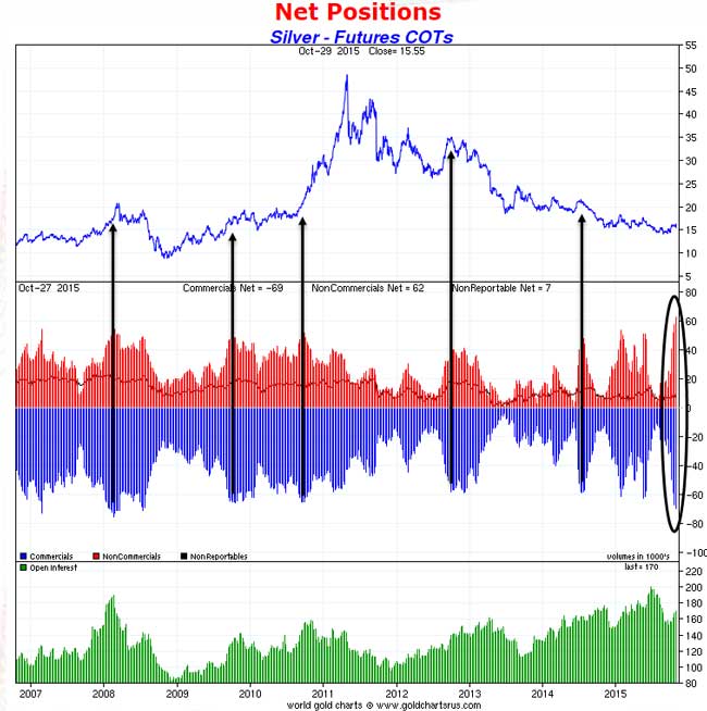
We see a bearish evolution in precious metals. It is evidenced mostly by the price action in silver, combined with the COT report in the silver futures market COMEX. First and foremost, our key indicator when it comes to the short and medium term outlook for precious...
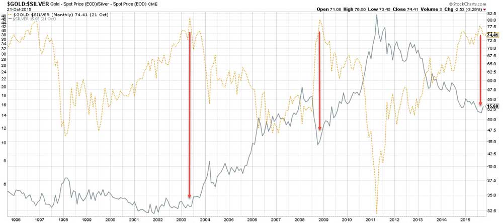
One of our favorite ratios is the gold to silver price ratio. It is important to understand how to interpret that ratio, and, even more importantly, how NOT to use it. When it comes to the gold to silver ratio, we would recommend not to use it as a short term...